Sanborn Fire Maps
By Jennie Shurtleff
Sanborn maps are a valuable resource for understanding the evolving streetscapes of American towns from the late 19th century through the mid-20th century. Created by the Sanborn Map Company, these maps were primarily designed to help insurance companies assess fire risk and determine appropriate insurance coverage.
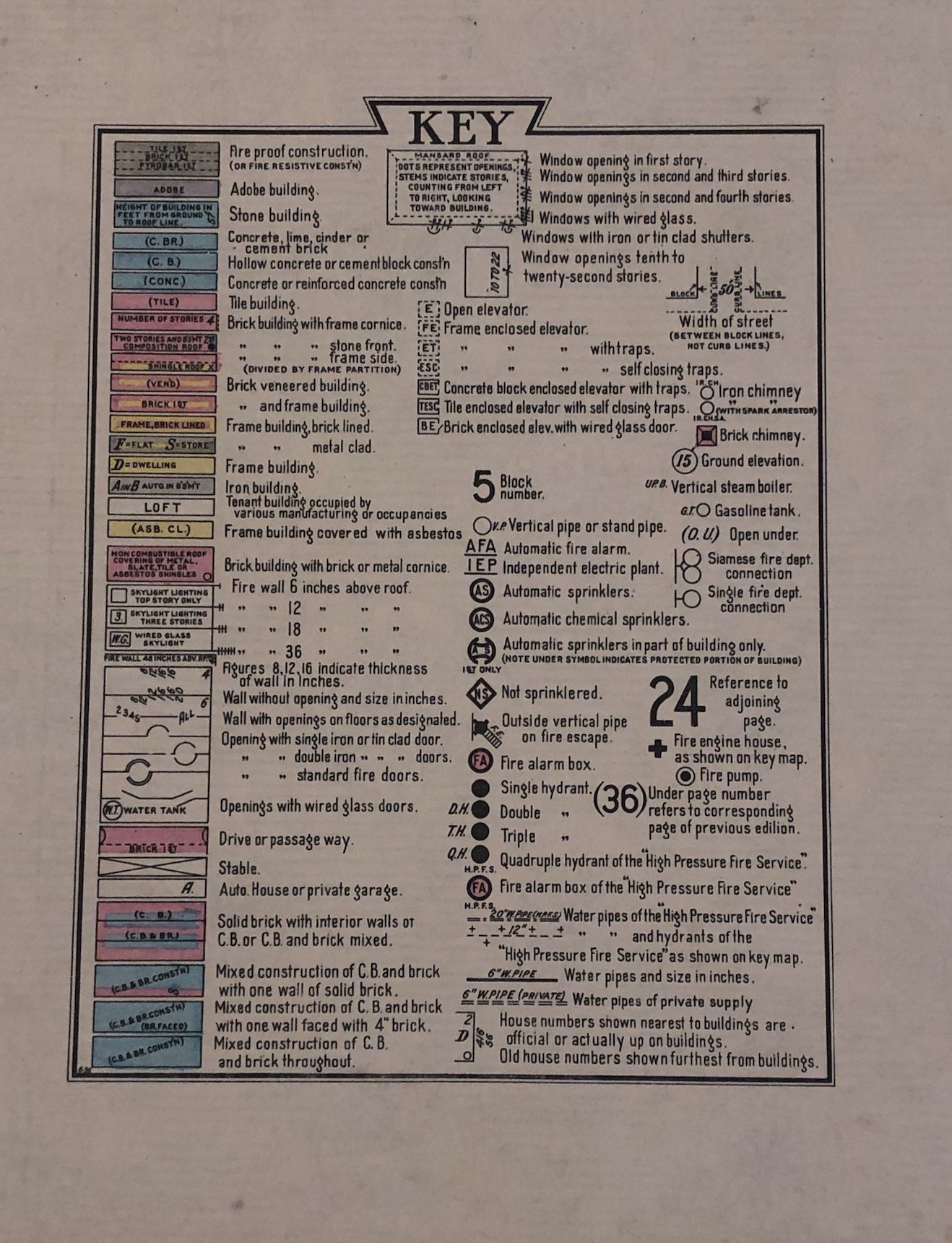
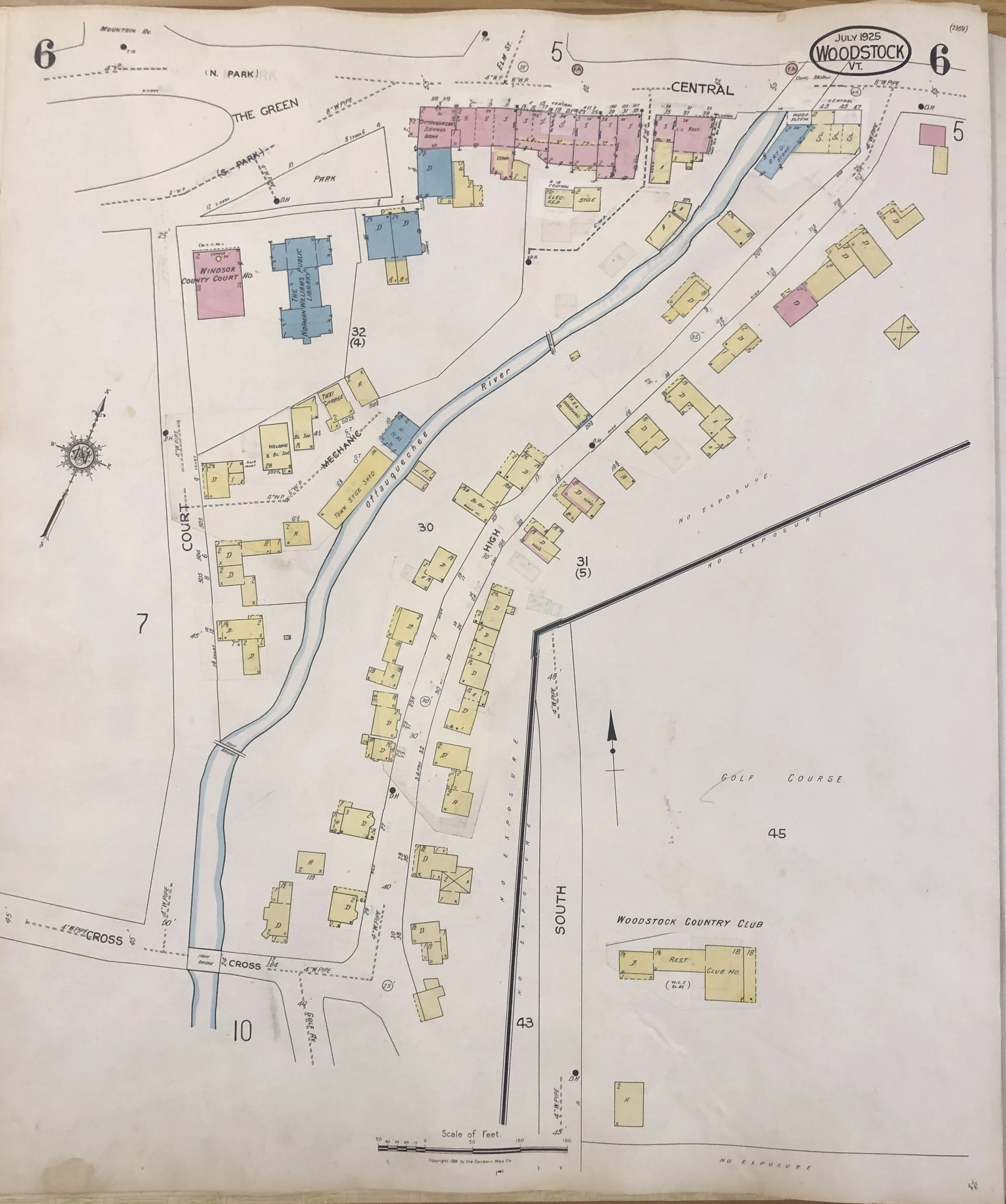
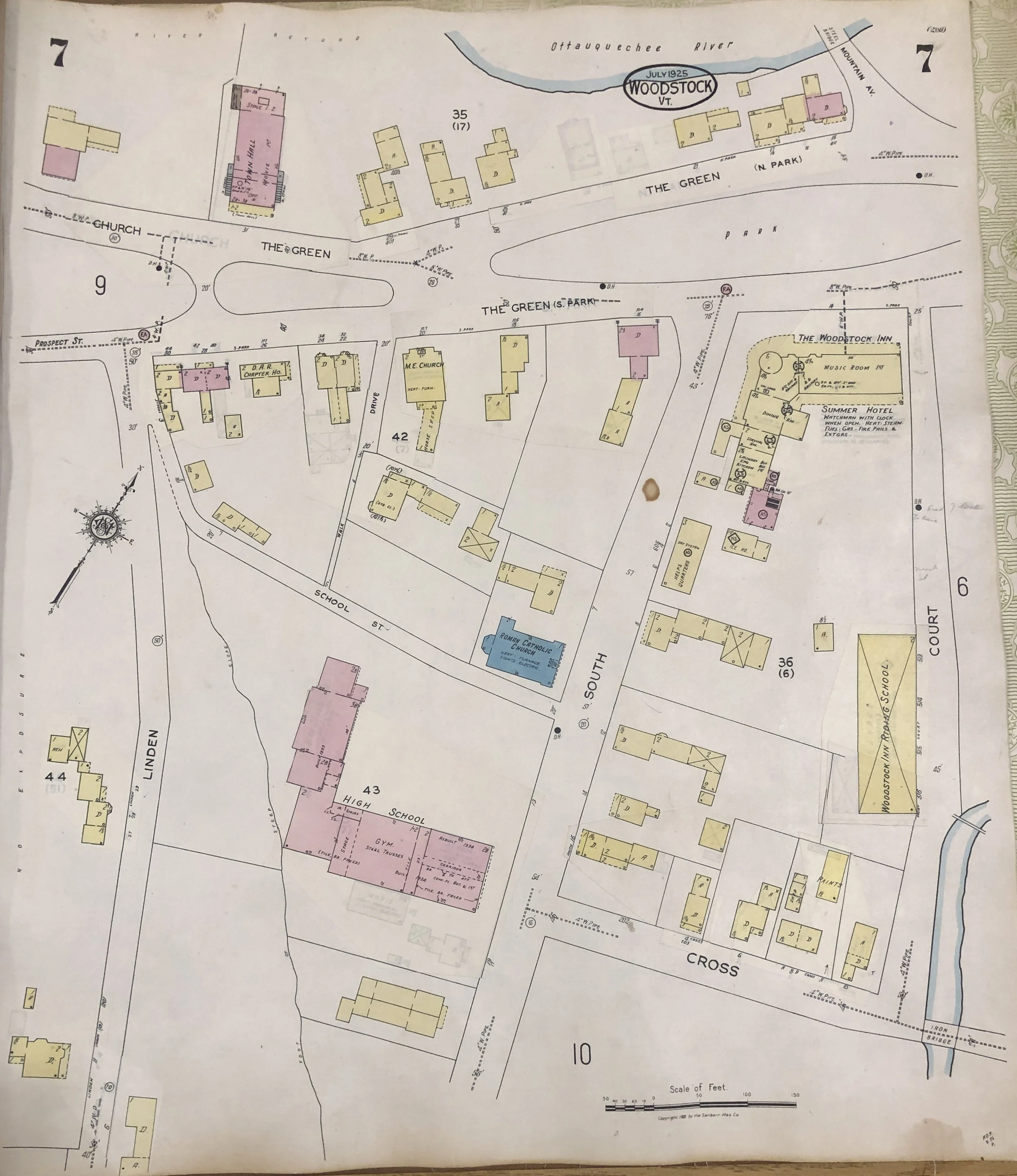
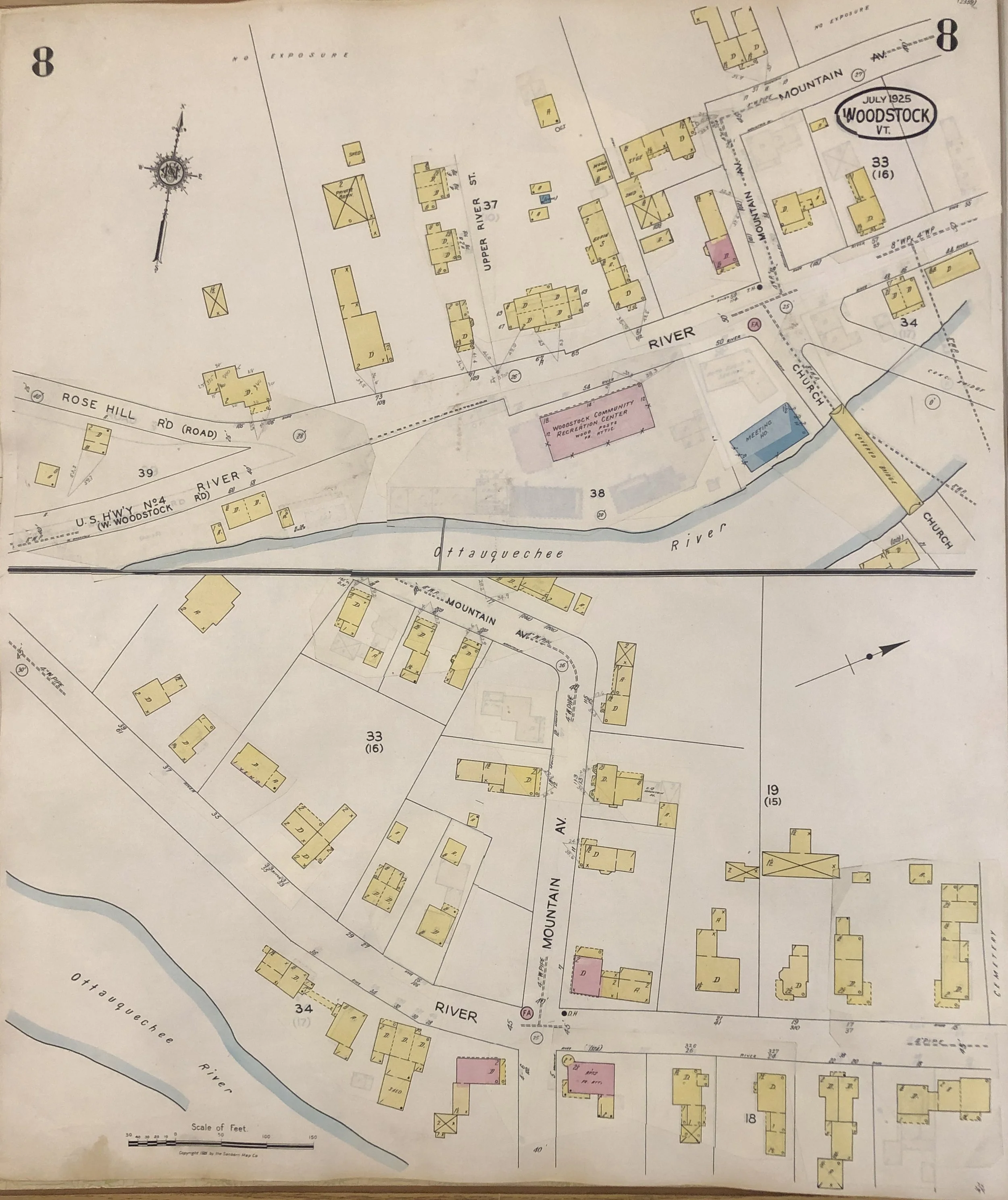
Because their primary audience was fire insurance providers, Sanborn maps focused on details relevant to fire risk assessment. These included the materials used in a building’s construction, the number of stories, framing type, roof composition, the placement of doors and windows, and how the building was being used.
Additional information—such as the height of buildings, street names and widths, fire hydrant locations, natural water sources, water pressure, and the specifications of water lines and pumping equipment—was also included to help evaluate accessibility and firefighting capabilities.

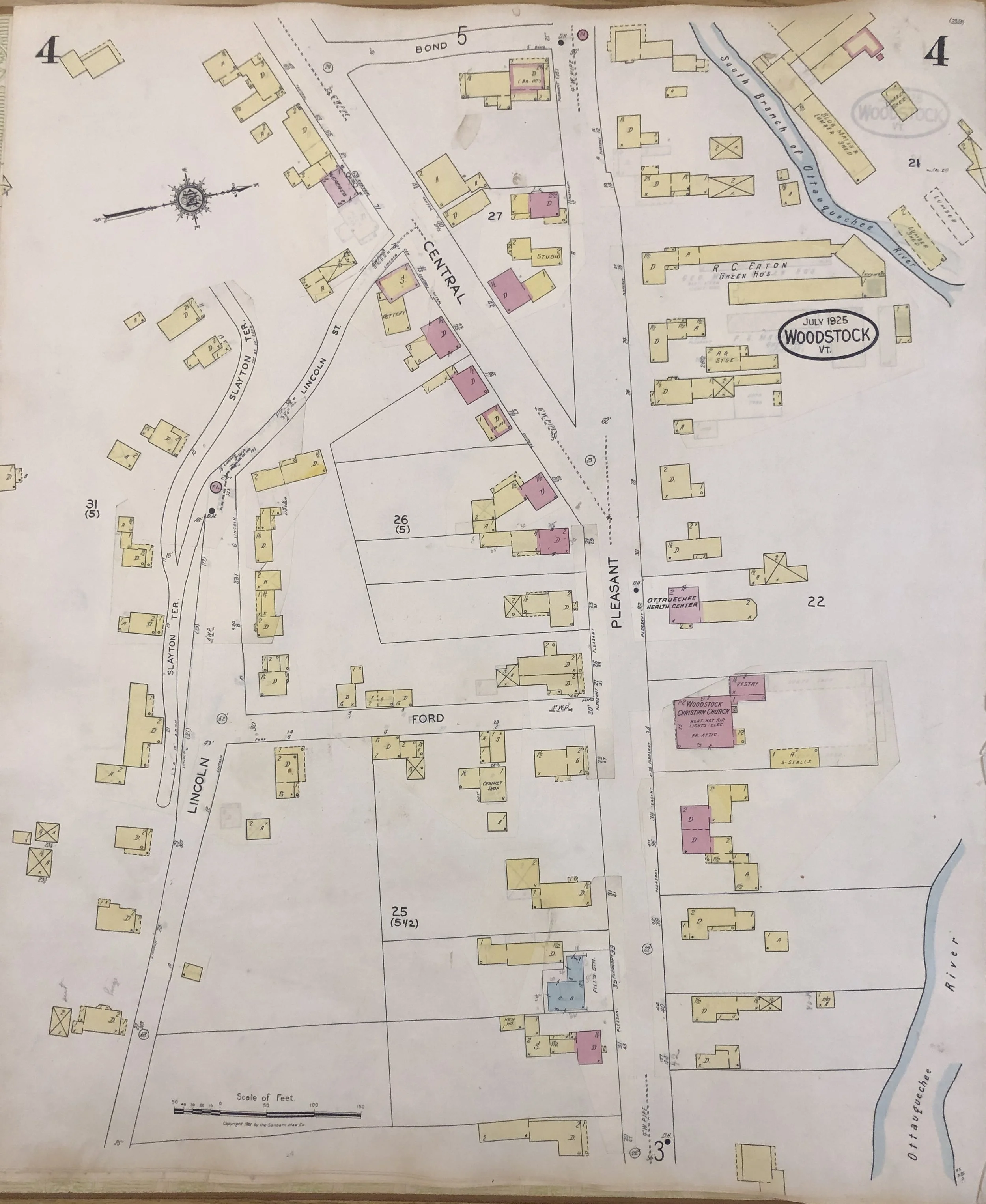
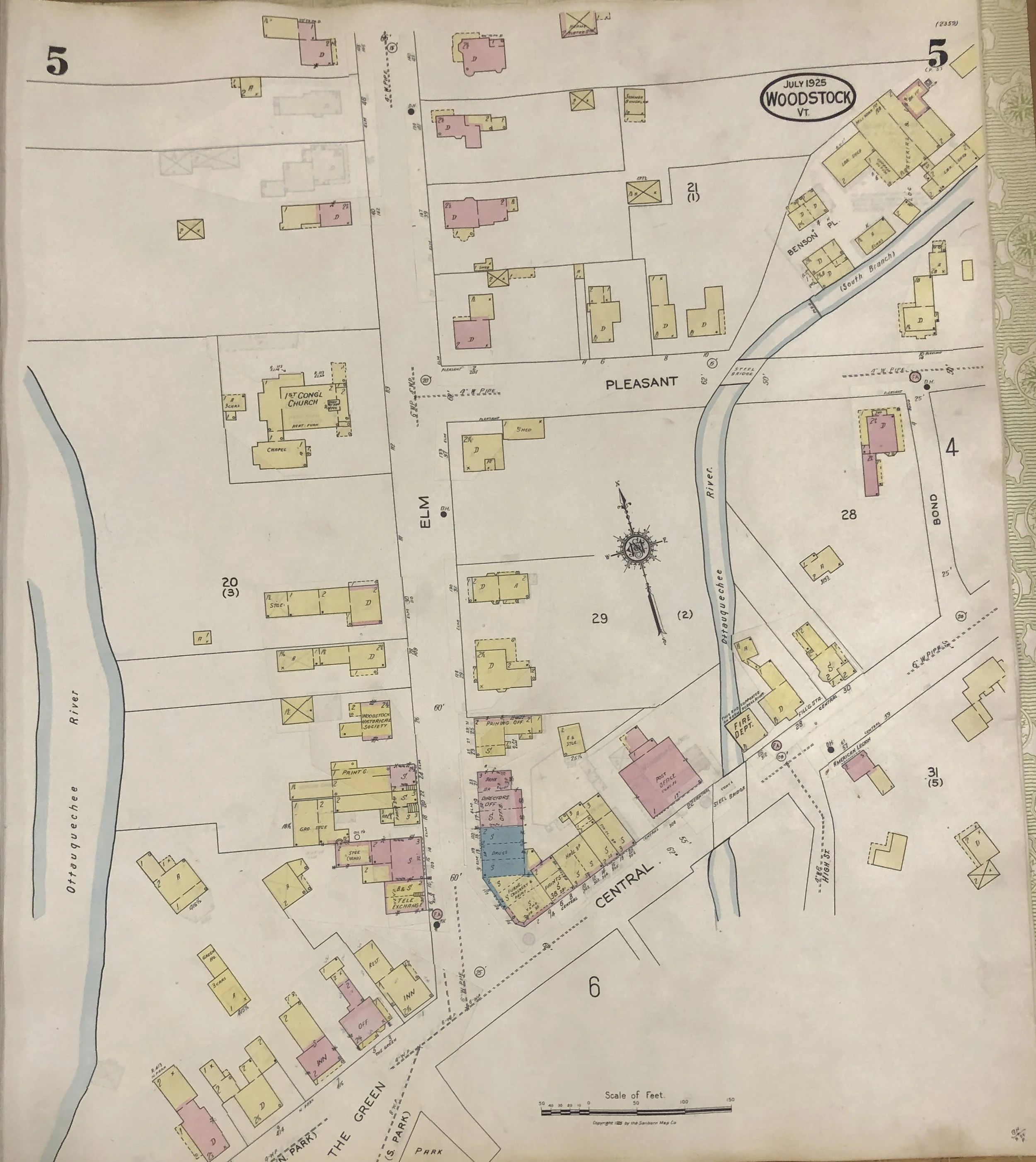
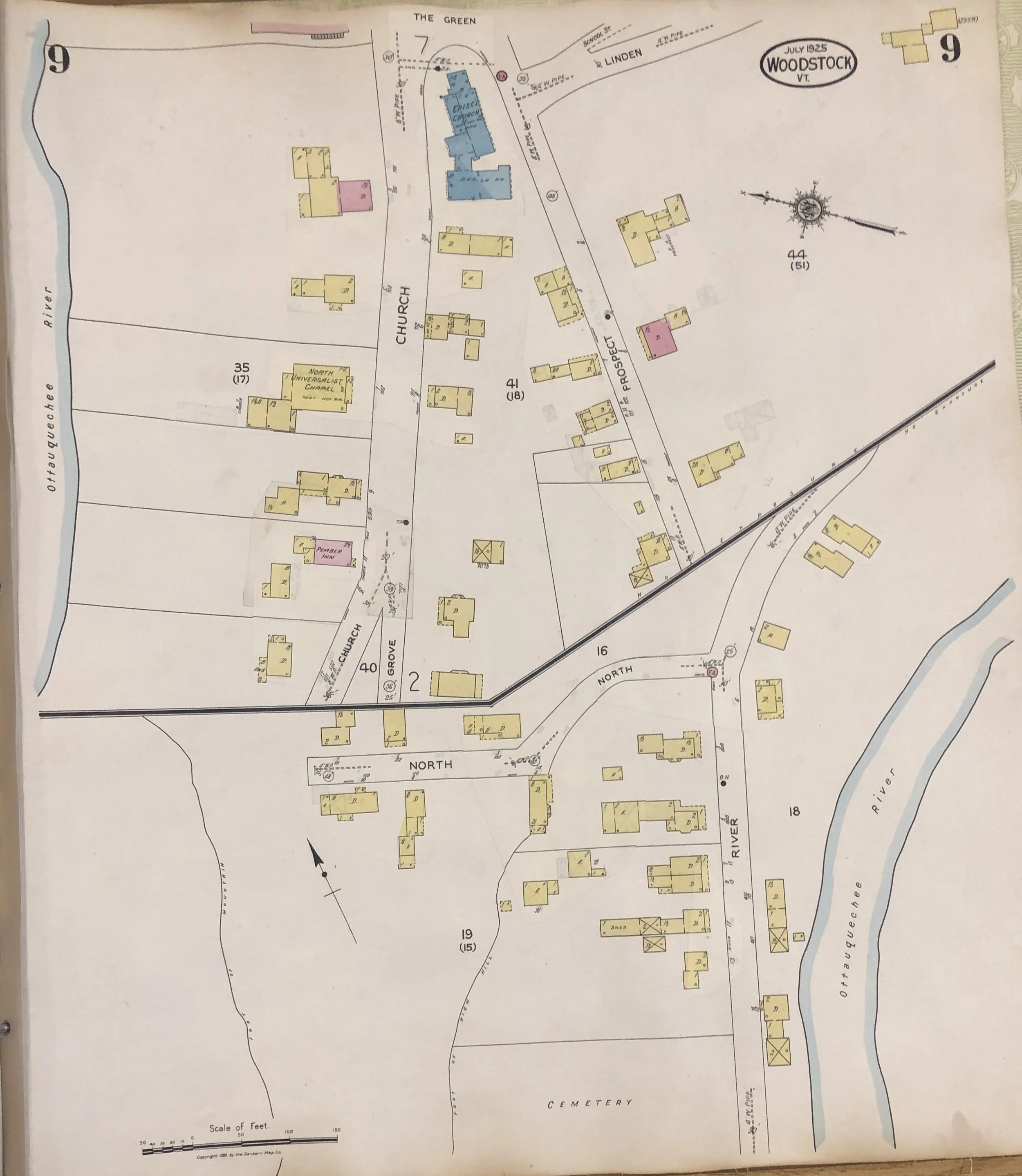
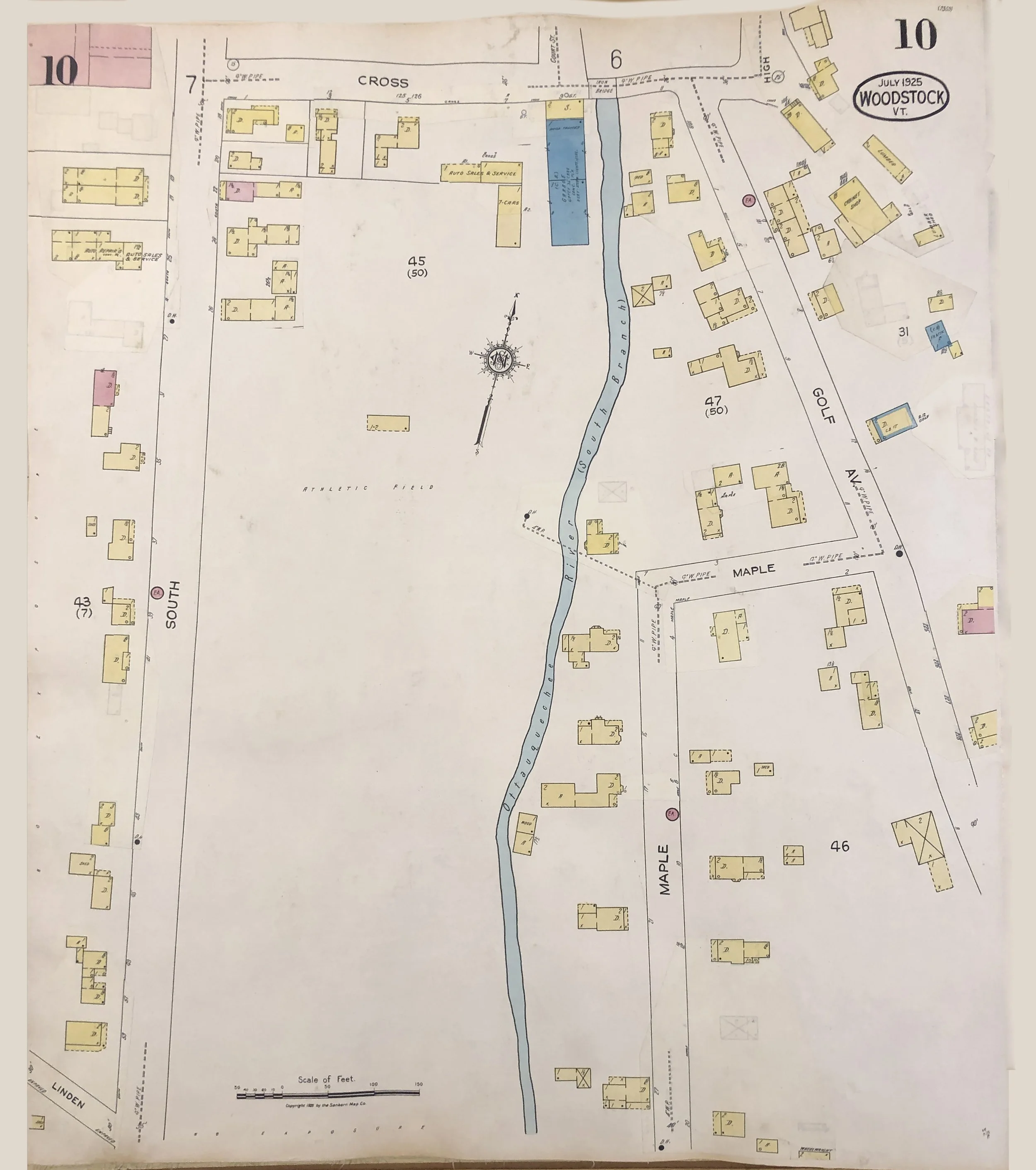
In the above detail showing the intersection of South Street and Cross Street, the map shows a number of structures used as dwellings (indicated by the abbreviation “D”). It also shows how many floors these buildings have, the locations and diameters of the water pipes (which are described as 4”), and the location of the South Branch of the River. Additionally, it labels prominent public buildings - like the School, Catholic Church, and Riding School - and differentiates the materials from which each is constructed (brick, stone, and wood, respectively).
Since Sanborn maps were periodically updated to reflect major changes to the built environment, they serve as a useful tool for tracking historical development. For example, a comparison of the map from 1885 to one forty years later in 1925 reveals, a number of changes to the Village Square. These changes include re-purposing buildings to new uses, the addition of new buildings, and the removal of old ones.

The side-by-side details shown above make it easy to see how Woodstock’s Village Square changed in a 40-year period between 1885 and 1925. For instance, notice the building located at 1 The Green; it changed from a dwelling house in 1885 (as indicated by the abbreviation “D”) to an inn and restaurant in 1925. Further down the west side of Elm Street, a new framed building was added between 1885 and 1925. This building had a brick exterior (as indicated by the pink-edged coloration of the yellow-shaded block), and it housed a telephone exchange, a barbershop, and a store in 1925. The building immediately to the north, in 1885, had housed a tailor, barber, hardware store, grocery store and doctor’s office; however, by 1925, it had two new additions on the back and housed a store.
Many Sanborn maps were color-coded to indicate construction materials—an essential detail for fire risk evaluation. As shown in the key for Woodstock’s Sanborn maps, reddish hues indicate brick buildings. The key further distinguishes between solid brick and veneer. Blue indicated stone. Yellow was for framed buildings, and gray for cement and adobe buildings.
While these colors were critical for insurance purposes, they also allow modern viewers to better imagine how a streetscape might have appeared—particularly in cases where photographs are unavailable.

The Woodstock History Center is fortunate to have a colorized 1925 Sanborn map in its collection, which was updated into the 1960s using paste-in correction sheets and handwritten annotations. These correction sheets allowed for cost-effective updates without the need to reprint entire volumes for minor changes. Sanborn representatives—nicknamed “pasters”—would visit subscriber insurance offices to apply these updates directly. They also added a dated correction slip at the front of the volume to indicate when the last update had been made.
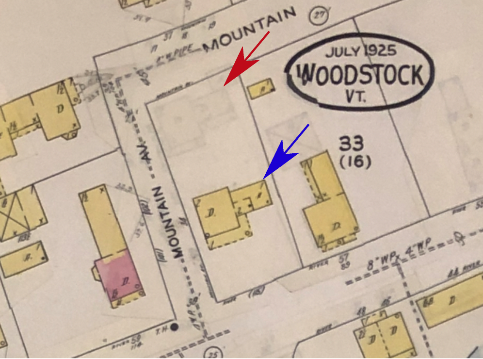
The above map detail shows an example of a map that has been updated with a pasted correction sheet. If you look carefully at the above image, you’ll see the “ghosted” footprints of previous structures that have been moved or removed.
For instance, look at the house on Mountain Avenue that is marked with a blue arrow. Notice that behind it - next to the red arrow - is a very faint footprint of it. That footprint shows were the building was originally located before being moved to its present location, which is closer to River Street.
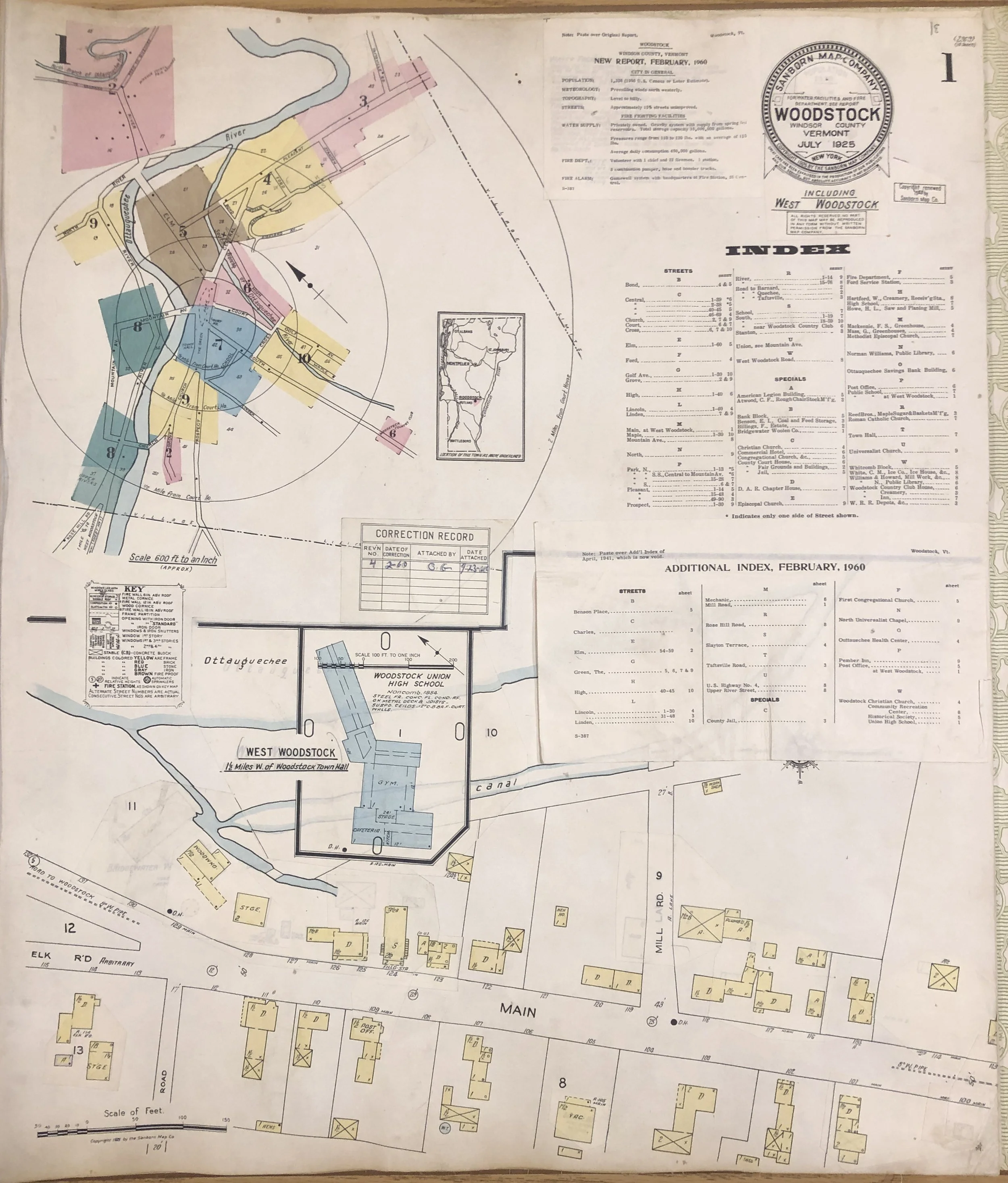
Below is a digitized version of the History Center’s Sanborn Map volume, which consists of a key and maps covering the most populated areas of the village. Click the thumbnails below the key to view close-ups of the maps in this volume.